New Dawn Recruitment
Website (UI/UX)
Helping job seekers and employers connect faster through streamlined recruitment.
Project overview
Career progression is an emotional journey. New Dawn Recruitment, an ethical boutique healthcare agency; needed a digital platform that honours that growth. Building from the ground up to replace a defunct site, I designed a frictionless UX that strips away unnecessary login barriers. The result is a scalable, premium hub that respects a candidate’s time and drives fast applications.
The Challenge: Transforming a static information site into a high-performance recruitment platform with a seamless, account-free application journey.
Project Scope: I led the complete rebuild, designing a custom job board, a modernised cyan UI, and a frictionless layout that ensures visual impact regardless of vacancy volume.
Industry
Recruitment
Duration
2 months
Tool Used
Figma
WordPress
Design Process

User Research
Target Personas
Journey Mapping

Colour Palette
Workflow Mapping
Design Systems

Interactive Mock-ups
Usability Testing

Site Deployment
Project Launch
Discover
My goal was to bridge the gap between their hands-on recruitment expertise and their online presence. By doing this, the site could become a tool that breaks that frustrating cycle and kicks off a real career growth journey.
Competitor Analysis

Key Strategic Takeaways
Personalised Support Gap:
Major platforms like Blue Arrow prioritise high-volume automation over human connection. This leaves a massive void for candidates and clients who want tailored, one-to-one guidance.
Self-Service Friction:
Platforms like Care.com rely on a self-service model that shifts the burden of vetting and filtering onto the user. This feels cold and transactional, creating a major barrier for high-tier talent and busy businesses.
Boutique Opportunity:
By stripping away the “digital factory feel” of these larger platforms, I could position NDR as a human-centred alternative. The focus shifted to designing a premium space that restores trust, confidence, and community care.
Target Personas


Pain Points
Analysing the friction points for both Sara and Garry revealed a common enemy: time. While their daily needs differ, both users were being drained by a lack of clarity and repetitive data entry. Sifting through these symmetrical frustrations forced a major shift in my design direction. Originally, I was heading down a standard path to build a high-volume, generic job board.
However, realising that raw digital noise would only worsen Sara’s application fatigue and Garry’s screening burnout, I pivoted the strategy entirely towards a specialised, high-touch boutique experience. To achieve this, the design focus shifted away from generic layouts and towards solving four critical architectural hurdles:
Accessibility Barriers:
Legacy workflows made it difficult for job seekers to discover and apply for roles quickly, leading to high drop-off rates.
Administrative Friction:
Information Gaps:
Manual Vacancies:
Ideate
Strategic Pivot
Short Description Baseline:
Testing confirmed that the brief, vague 5-line paragraphs left job seekers uncertain about specific roles. This lack of clarity was the direct cause of high drop-off rates and a flood of mismatched inquiries.
Structured Framework:
Splitting the information into three defined pillars – Overview, Duties, and Skills proved far more effective at building user confidence. To scale this success, I designed an employer intake form to automatically generate this rich data layout on the backend.
Card Sorting

Key Strategic Takeaways
Building Trust:
Pain points like hidden fees and slow recruitment were major frustrations for users. The platform needed clear information and regular updates to build trust.
Simplifying Applications:
Users wanted a quick application process and an easy way to track their submissions. This made these capabilities the essential platform features.
Human Connection:
Feedback highlighted a demand for specialist advice and personalised support. This reinforced the importance of keeping human assistance easily accessible.
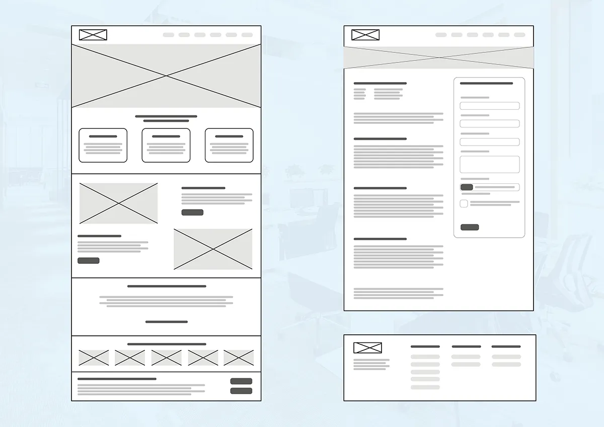
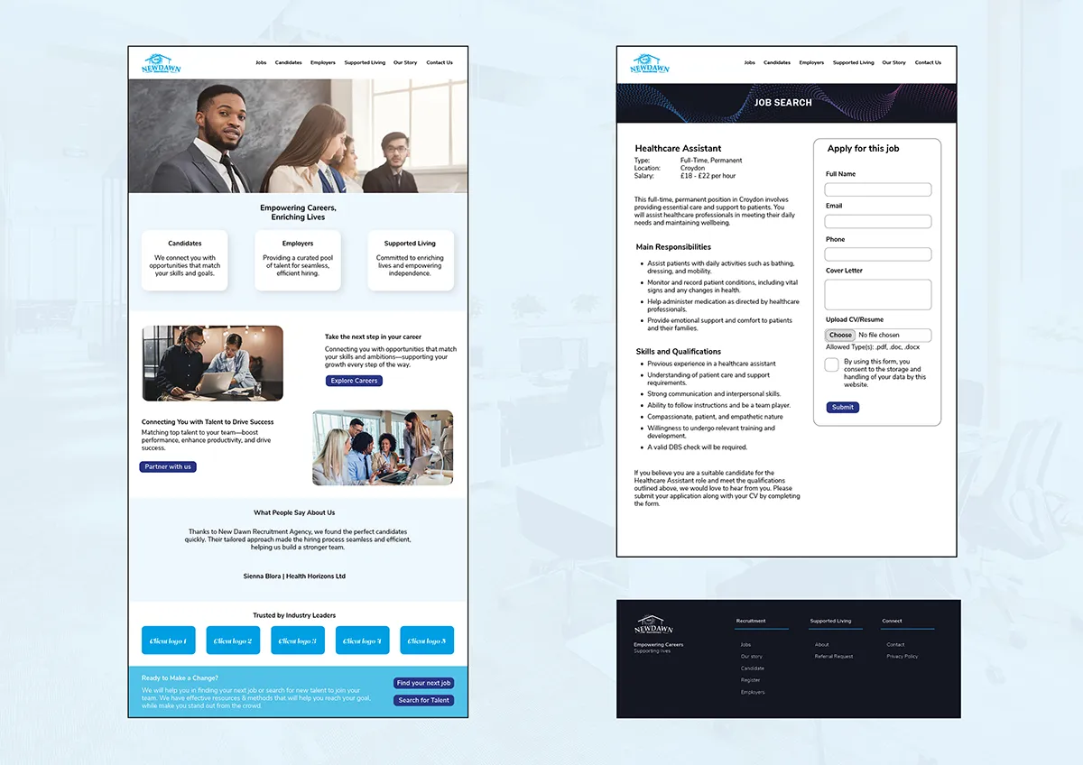
Prototype
Try It Yourself
Drag the slider to trace the transformation of the interface—from the initial functional “skeletons” to the final, high-fidelity Boutique experience.
Usability Testing
Key Strategic Takeaways
Accelerated Completion:
An impressive 80% of users completed the full application under ten minutes. The simplified structure proved that reducing complexity directly enabled faster, stress-free engagement.
Refined Logic:
Smart form-field logic removed the navigation issues found in earlier testing. This allowed users to move through the process seamlessly without friction or confusion.
Professional Standard:
Feedback from recruitment leads confirmed the streamlined process felt more premium and professional. It successfully replaced outdated, PDF-based applications with a modern experience.
Define & Deliver
By transforming fragmented user pain points into a polished, high-conversion platform, this strategy-first approach successfully eliminates core friction for both candidates and recruiters, delivering a scalable foundation that positions the agency as a premium leader in the high-end talent market.

Project Reflection
This perspective helped me design an empathetic, streamlined experience that respects the job seeker’s time while simultaneously improving efficiency for the agency.
View More Projects
28 Days of Logos
Design Challenge[dsm_dual_heading before_text="Creativity is best trained" middle_text="through practice and iteration." middle_background_color="RGBA(255,255,255,0)" before_display_type="block" _builder_version="4.27.4" _module_preset="default"...

Neurabrand Ai
website (ui/ux)[dsm_dual_heading before_text="Revolutionising how brands engage audiences " middle_text="through bespoke AI avatars" middle_background_color="RGBA(255,255,255,0)" before_display_type="block" _builder_version="4.27.4" _module_preset="default"...
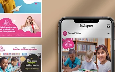
Tanzeel Tuition
Social media [dsm_dual_heading before_text="Empowering students to unlock their potential" middle_text="through evening and weekend learning." middle_background_color="RGBA(255,255,255,0)" before_display_type="block" _builder_version="4.27.4" _module_preset="default"...