Neurabrand Ai
website (ui/ux)
Revolutionising how brands engage audiences through bespoke AI avatars
Project overview
The Challenge: To balance sophistication with clarity, creating a premium digital experience that simplifies complex AI into an intuitive and approachable user journey.
Project Scope: The goal was to bridge the gap: building a site that feels like a luxury brand at first glance while making complex AI services feel both premium and seamlessly accessible.
AI Digital Media
Duration
3 months
Tool Used
Adobe Illustrator
WordPress
Design Process

Competitor Analysis
User Journey Map
Market Research

User Flows
Colour Palette
Mood Boards

Usability Testing
Interactive Prototypes

Platform Launch
Post-Launch Tuning
Discover
The journey began by uncovering the brand essence and its audience through research and competitive analysis. I explored how to position NeuraBrand.ai at the intersection of innovation and luxury. This allowed me to balance high-end aesthetics with clarity, building a foundation that was both functional and visually striking.
The Value Proposition Canvas

Key Strategic Takeaways
Bridging the Consistency Gap:
My research showed that users struggle to maintain a high-end visual identity when using fragmented Ai tools. I designed the site to position NeuraBrand Ai as the premier solution that ensures absolute visual consistency and prestige.
Elevating Scalability:
A core ‘gain’ for the target audience was the need for luxury-quality content at scale. The UI was built to emphasize speed and premium output, moving away from the slow, costly, and traditional DIY design methods.
Reducing Technical Friction:
To address user resistance to complex AI workflows, the website’s messaging and user flow were crafted to feel entirely hassle-free and intuitive—highlighting a seamless premium service rather than complex technology.
Customer Journey Map

Key Strategic Takeaways
Building Confidence:
The map identified an initial knowledge gap regarding AI capabilities. I addressed this by prioritising high-impact visual education in the hero section, moving users from curious to excited within seconds.
Curing Choice Paralysis:
At the selection stage, users often feel overwhelmed by AI’s vast potential. I structured the portfolio and services as a curated gallery, helping clients easily visualize how it applies to their brand.
Overcoming Hurdles:
To solve the potential dip right before submission, I designed a clear, guided transition to the contact form. This replaces user hesitation with a fully supported, premium onboarding experience.
Ideate
With a clear strategic foundation in place, I transitioned into ideation. To maximize efficiency and ensure absolute alignment, I pivoted from standard remote communication to an in-person session. This was triggered when the client was unsure about certain complex layout concepts. We reviewed the live designs together on my staging site using a larger display. This allowed me to explain the mechanics clearly, provide deeper elaboration, and keep us completely synchronized. This collaborative pivot became the exact catalyst we needed to co-create the interactive Avatar Inspiration Hub and its seamless briefing system.
Brand Colour (#1e1d2e)
Acts as the foundation colour, giving the site a premium and trustworthy feel.
Interactive Element (#d1d0e0)
Balances the dark navy by adding a forward-looking, imaginative tone signalling the cutting-edge nature of bespoke AI avatars.
Backdrops (#e7e8f1)
Serves as a clean backdrop or accent space that makes content and visuals feel uncluttered and high-end, while keeping accessibility and readability strong.
Buttons (#d4af37)
Used as an accent (buttons, highlights), it draws attention to key actions or details while reinforcing the brand’s premium, high-value positioning.
Colour Palette
Mood board
The mood board combines NeuraBrand.ai’s brand colours with tech-forward imagery futuristic cityscapes, AI avatars, behind-the-scenes visuals to convey innovation and sophistication. Typography choices (Oswald and Open Sans) were deliberate: bold yet readable, complementing the high-end aesthetic. Collages and hover overlays were chosen to highlight engagement and impact, reinforcing a cohesive, luxury tech brand experience.

Prototype & Testing
Interact with the wireframes below to explore the functional layout, user flows for both desktop (by hover over) and mobile (by tapping it).
Desktop (Content Hierarchy)

Mobile (Responsive Design

Key Strategic Takeaways
01 | User Friction:
Testing revealed that AI beginners felt overwhelmed by complex technical phrasing during onboarding, while power users required rapid, direct access to generation tools.
02 | The Strategic Pivot:
In response, I restructured the primary user flow to introduce a simplified, visual ‘one-click’ onboarding wizard tailored specifically for beginner demographics.
03 | The Unified Result:
By preserving a high-efficiency dashboard shortcut for advanced users alongside the wizard, this layout successfully bridged accessibility with deep utility..
Define & Deliver

Project Reflection
The client was ecstatic with the outcome, which has already received immense praise from their industry peers. Navigating these unique challenges was incredibly rewarding, leaving me keen to explore this space further.
View more projects
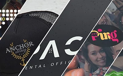
28 Days of Logos
Design Challenge[dsm_dual_heading before_text="Creativity is best trained" middle_text="through practice and iteration." middle_background_color="RGBA(255,255,255,0)" before_display_type="block" _builder_version="4.27.4" _module_preset="default"...
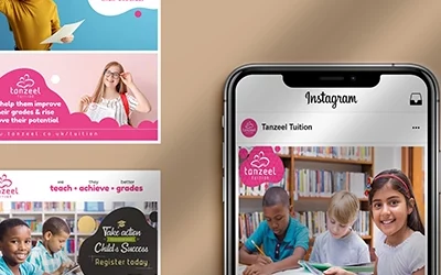
Tanzeel Tuition
Social media [dsm_dual_heading before_text="Empowering students to unlock their potential" middle_text="through evening and weekend learning." middle_background_color="RGBA(255,255,255,0)" before_display_type="block" _builder_version="4.27.4" _module_preset="default"...
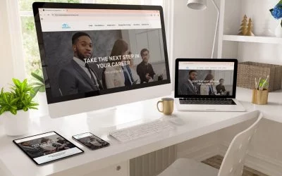
New Dawn Recruitment
Website (UI/UX)[dsm_dual_heading before_text="Helping job seekers and employers connect " middle_text="faster through streamlined recruitment." middle_background_color="RGBA(255,255,255,0)" before_display_type="block" _builder_version="4.27.4" _module_preset="default"...