UNMC Presentation
Digital design
Designing systems that bridge generationsclarity that supports every service
Project overview
The Challenge: The audit revealed recurring communication issues, including inconsistent Order of Service presentations that made hymns, Bible verses and service information difficult to follow.
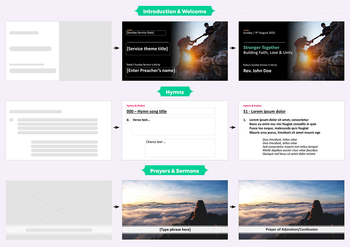
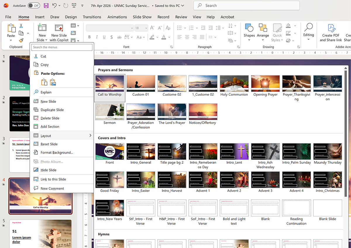
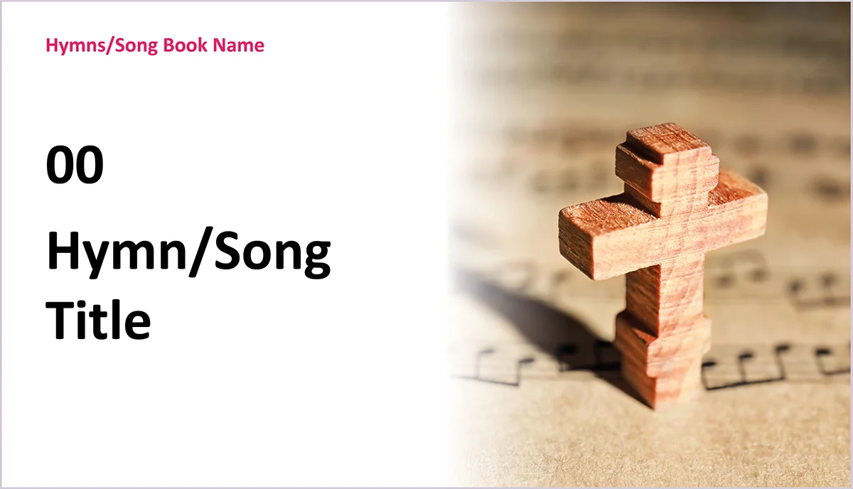
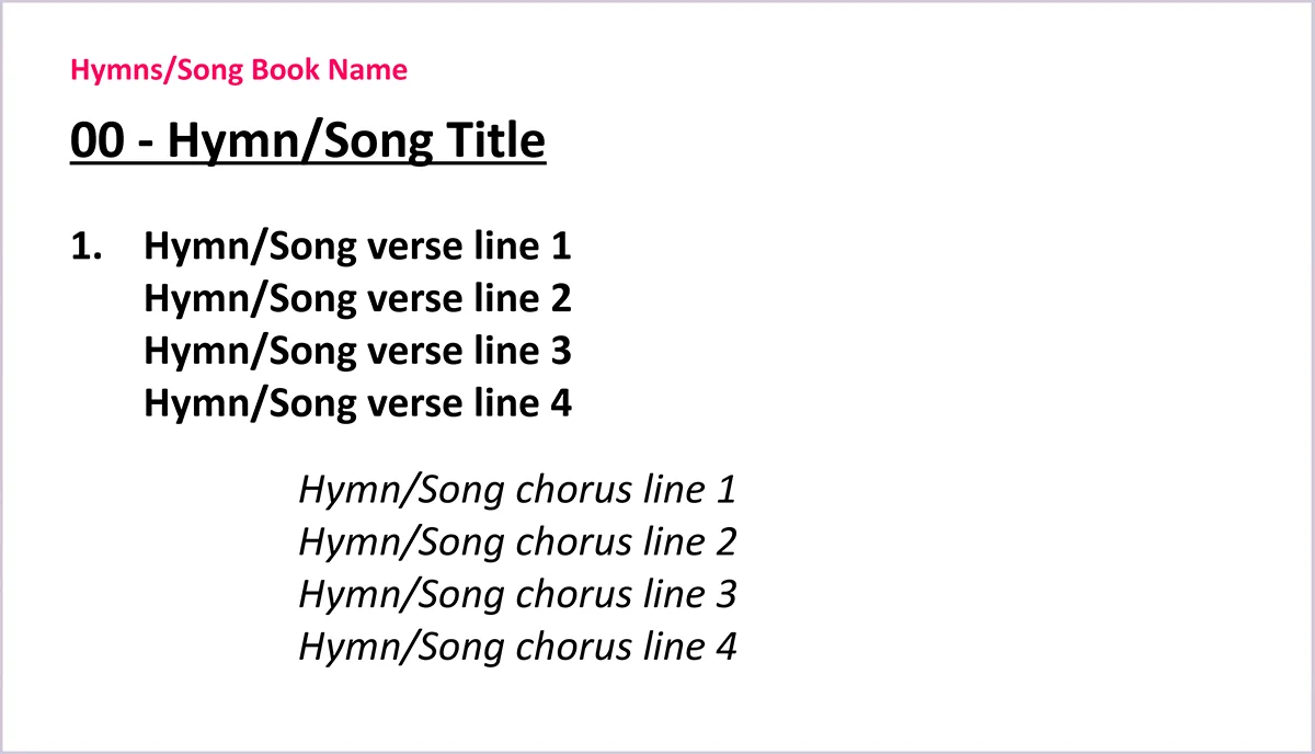
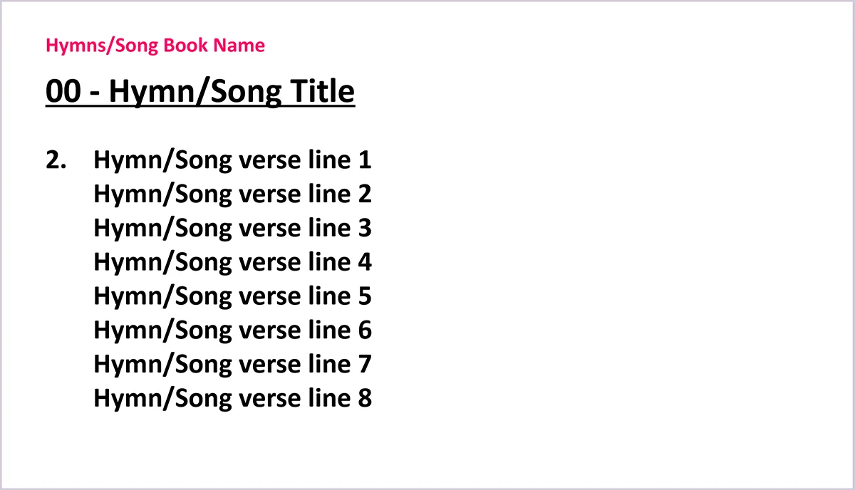
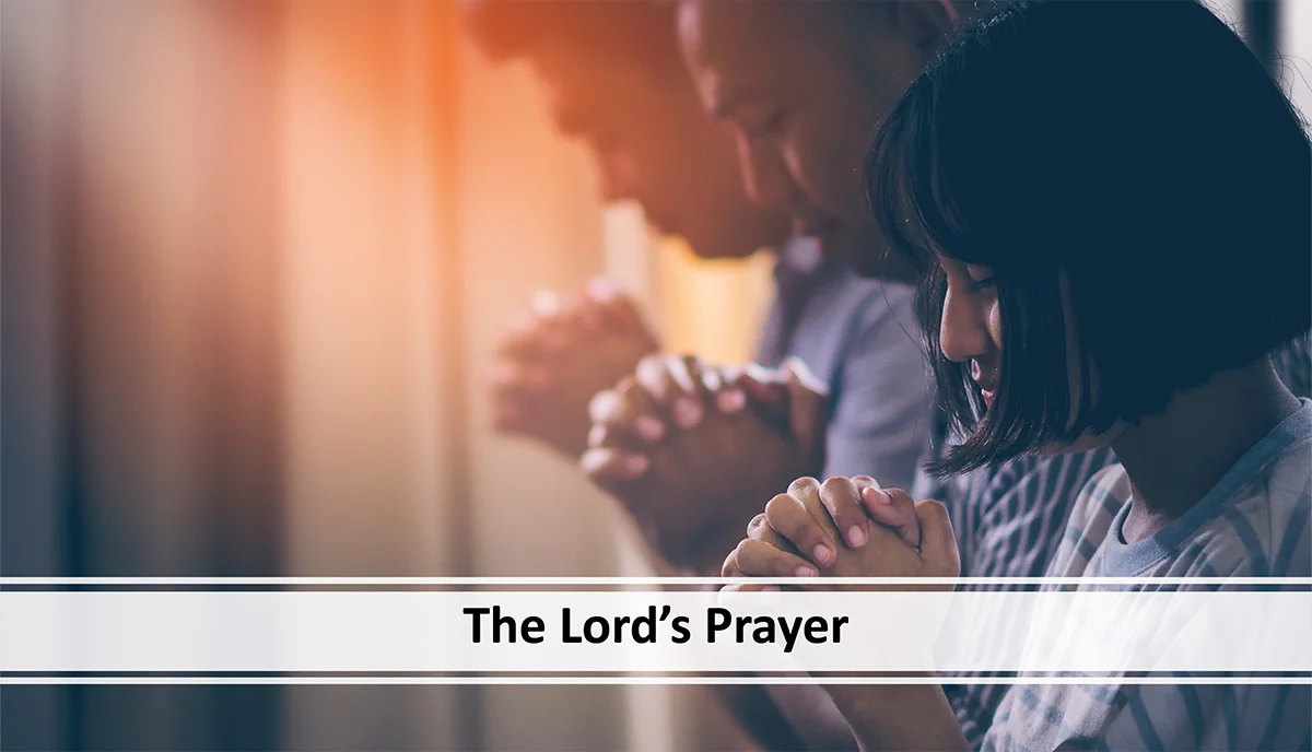
Project Scope: I identified a recurring communication problem, analysed existing Order of Service presentations, and designed a 61-slide layout system, still used by the church today.
Church Community
Duration
3 weeks
Tool Used
PowerPoint
InDesign
Design Process

Problem Diagnosis
User Research

Content Architecture
Modular Layout
Visual Strategy
Layout Development
System Packaging
UX Testing

Feedback & Iteration
Discover
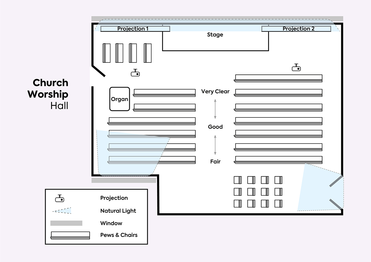
After some time away, I returned to the church with the aim of helping it improve through a self-initiated project, alongside requests from other members. While reviewing its processes, I noticed that services had recently started being projected, but inconsistencies in font size, colour, contrast and layout made them difficult to follow. Natural lighting also affected screen visibility. With a significant proportion of the congregation in their late 50s and above, clear legibility was particularly important. After gathering feedback from the congregation and media volunteer, I secured approval to redesign and standardise the system.
Environmental & User Audit
Key Strategic Takeaways
Venue Constraints:
With much of the congregation seated toward the back, long viewing distances meant projection sizing, text scale and layout needed careful consideration throughout.
Environmental Lighting:
Changing natural light created glare and visibility issues, requiring stronger contrast, clearer layouts and a visual standard that remained accessible for an older congregation.
Reducing Technical Friction:
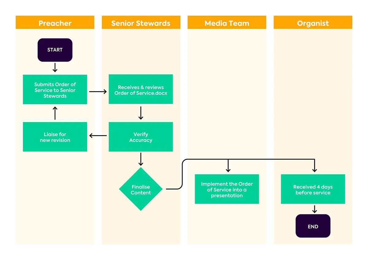
Decentralised drafts created friction during live services, introducing structured review points helped improve communication between leadership, volunteers and organist.
Ideate
The next step wasn’t as straightforward as expected. While the need for improvement was clear, changing an established way of working brought resistance from some within the council. I had to navigate differing perspectives while keeping the focus on the problem.
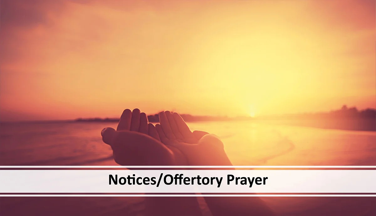
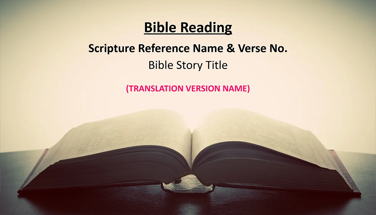
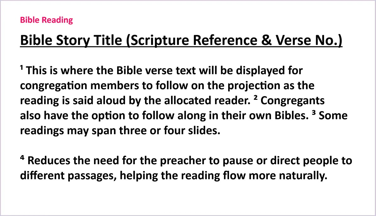
I mapped a typical one-hour service into its recurring elements, identifying what the presentation system needed to support. I structured hymns, Bible readings, prayers and service segments around varying content lengths, shaping a modular layout system beginners could use without rebuilding slides. I then developed a cohesive visual language through typography, imagery, contrast and seasonal themes for consistency across services.





Prototype & Testing
The system was packaged into a clearly labelled 61-slide master template and iteratively tested with users of varying confidence levels. It was also tested during Sunday services to refine visibility, readability and independent use.
Define & Deliver
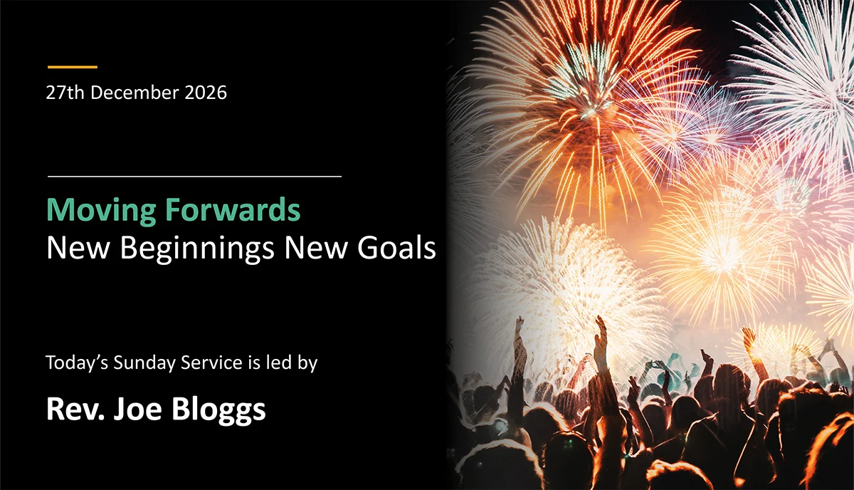
The result is a flexible, easy-to-use system that can be independently adapted for different services while remaining clear and consistent for the congregation. Designed for long-term use, the template has continued to be used effectively by the church from 2023 to the present.


View more projects

28 Days of Logos
Design Challenge[dsm_dual_heading before_text="Creativity is best trained" middle_text="through practice and iteration." middle_background_color="RGBA(255,255,255,0)" before_display_type="block" _builder_version="4.27.4" _module_preset="default"...

Neurabrand Ai
website (ui/ux)[dsm_dual_heading before_text="Revolutionising how brands engage audiences " middle_text="through bespoke AI avatars" middle_background_color="RGBA(255,255,255,0)" before_display_type="block" _builder_version="4.27.4" _module_preset="default"...
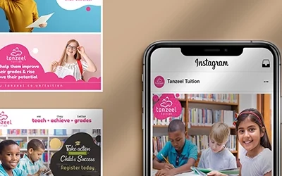
Tanzeel Tuition
Social media [dsm_dual_heading before_text="Empowering students to unlock their potential" middle_text="through evening and weekend learning." middle_background_color="RGBA(255,255,255,0)" before_display_type="block" _builder_version="4.27.4" _module_preset="default"...